
Tooltip
Tooltips display additional information upon hover or focus that is contextual, helpful, and provides clarity to a user.
Overview
Anatomy
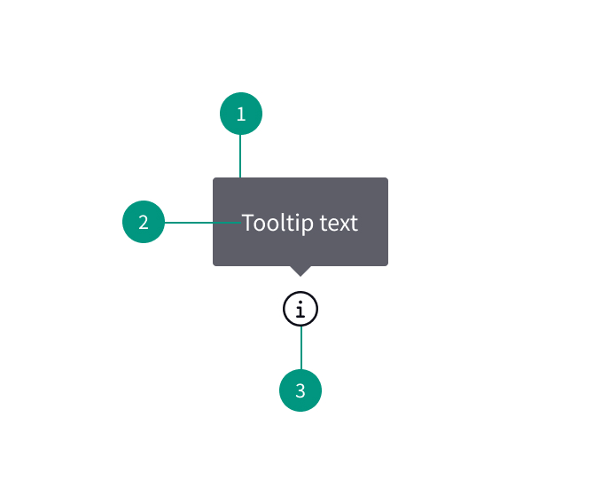
- Background
- Descriptive text
- Trigger icon
When to use
- To describe icon-only buttons
- To provide more information to help a user make a decision
- To provide more content or explanation
- To define a term or inline item
When not to use
- For information that a user needs to complete a task (use helper text instead)
Content
Use concise text
Text should be relevant and specific. Icon button tooltips should be limited to a one or two-word description of the button's function.
Make essential information visible
Don't hide essential task instructions behind a tooltip
Use full sentences
Use sentence case and write in complete sentences for definitions and instructive tooltips.
References
Tooltip Guidelines, Nielsen Norman Group
ARIA: tooltip role , MDN Web Docs
U.S. Web Design System (USWDS)