
Button
A button is an element in web design that represents an action or operation that the user can perform on a platform. Buttons are typically used for actions such as submitting a form, navigating to another page, confirming a decision, or initiating a process. They are visually designed to draw attention to the user to encourage them to interact with it.
Overview
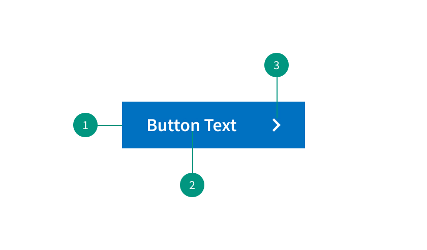
Anatomy
- Container: Container area for button content.
- Button text: Call to action to inform users what will happen on click.
- Leading visual: Leading visuals are icons that can provide additional context for a button label, such as a “search icon” (being a magnifying glass).
When to use
- To communicate actions users can take and allow users to interact with the page
When not to use
- As navigation elements (use links instead)
Best practices
Impose a button hierarchy
Consider creating a button hierarchy so that users can tell which button is of the highest priority.
Size for mobile
If designing for mobile devices, make sure that they are appropriately sized for touch interactions and easy to tap.
Provide visual feedback
Provide visual feedback when users interact with buttons by changing the color on hover or when clicked on.
Variants

Primary Button
Used for the main call to action. These should be used sparingly — ideally once per page.
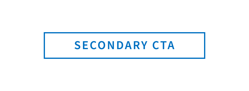
Secondary Button
For secondary actions on each page. Only use the secondary button when there is already a primary button on the page. As part of a pair, the secondary button should come second. The secondary button should be used for any negative actions like “back” or “cancel.” Do not use a secondary button for a positive action.
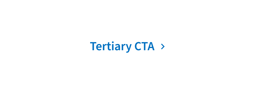
Tertiary Button
Used for less prominent actions. Tertiary buttons can be used for subtasks on a page such as a call to action at the bottom of a card.
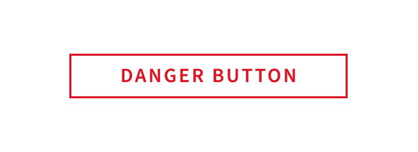
Danger Button
Used for actions that could have destructive effects (for example, delete or remove.)
Related components
Formatting
Placement
Place buttons based on the user's reading flow. Typically, buttons are placed at the bottom or to the bottom right of the form or content.
Content
Labeling
Use clear and action oriented labels that describe the purpose of the button - and why users should interact with it. Avoid using generic labels like “click here.”