
Checkbox
Checkboxes are used when multiple items can be selected in a list. Users can select zero, one, or several items. Checkboxes work independently from each other; checking one box does not affect any other selections. A standalone checkbox may be used for a single option that the user can turn on or off.
Overview
Anatomy
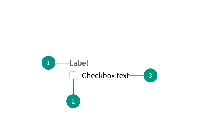
- Group label
- Checkbox
- Checkbox label
When to use
- When there are multiple choices
- For filtering and batch actions
- For acceptance criteria
When not to use
- When choices are mutually exclusive (use radio buttons or a toggle switch instead)
Best practices
Do not pre-select checkbox options
Pre-selecting options may lead users to make selections they don't intend.
Include "none" as an option
Give users the option to indicate that none of the other options apply.
Use for yes/no questions
Use a checkbox if you’re asking a single yes or no question (e.g. “Yes, sign me up for the Bradbury Center newsletter” vs asking “Would you like to sign up for the newsletter? Yes, sign me up OR No, please don’t send me the newsletter”).
Clearly indicate grouped choices
Visually present groups of choices as groups that are separate from other items on the page.
List only one choice per line
When checkboxes are laid out vertically, list only one choice per line.
Make the entire area interactive
Let users select an option by clicking on either the checkbox itself or on its label.
Don’t use checkboxes as action buttons that make something happen
Any changes should only take effect once the user clicks a separate action button to save or proceed.
Use cancel and back buttons as users would expect
Clicking a cancel or back button should discard any changes the user has made to their selections. If a user clicks back and then forward, interpret this as an Undo/Redo pair, meaning that the user’s selections should be restored as if the user had never clicked back. Changes should still not take effect until the user chooses to save or proceed.
Related components
Checkbox, toggle, or radio button: how to choose
|
Radio buttons |
Checkboxes |
Single checkbox |
|
Multiple |
Multiple |
1 |
|
1 |
0–all |
2 (on/off) |
|
Yes |
No |
Yes |
|
Yes |
No |
Yes |
|
After a user clicks a submit button |
After a user clicks a submit button |
After a user clicks a submit button |
Formatting
Alignment
Checkbox labels are positioned to the right of their inputs.
Checkbox groupings can be laid out vertically or horizontally depending on the use case. When possible, arrange checkbox groups vertically for easier reading.
Content
Labels should be scannable.
Use positive and active wording for checkbox labels, so it’s clear to users what will happen if the checkbox is selected.
Write checkbox labels so users know what will happen both if the box is selected and if it is unchecked.
Behaviors
States
A checkbox state may be unselected, selected, or indeterminate. The default view of a set of checkboxes is having no option selected.
Use the indeterminate state when the checkbox contains a sublist of selections, some of which are selected, and some unselected. In addition to unselected, selected, and indeterminate states, checkboxes also have states for focus, disabled, read-only, error, and warning.
Nesting
Checkboxes can be nested when a parent and child relationship is needed. Users can either select an entire set of options or only a subset.
Checking the parent checkbox automatically selects all of the nested children checkboxes. Unchecking the parent checkbox automatically deselects all of the children checkboxes.
References
Checkboxes vs. Radio Buttons, Nielsen Norman Group
U.S. Web Design System (USWDS)