
File uploader
The file uploader lets users select one or more files to upload to a specific location. File uploaders are commonly found in forms, but can also be a standalone element.
Overview
Anatomy
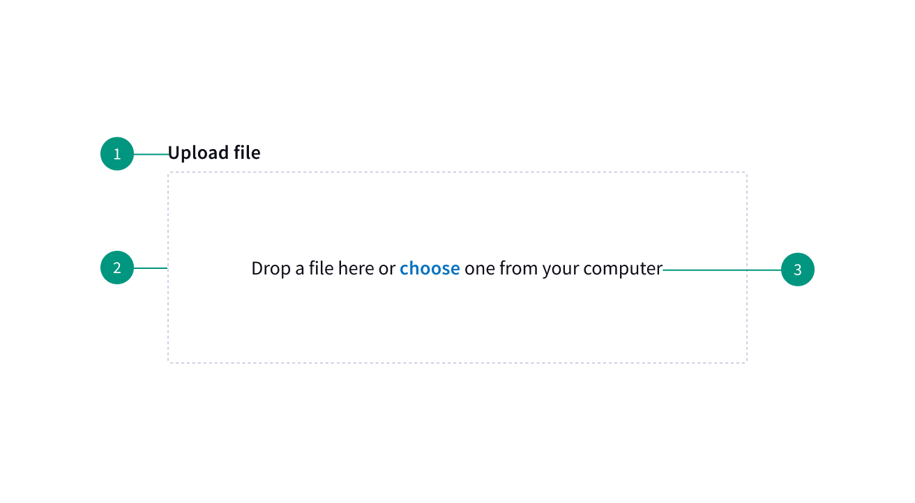
- Label
- Drop area
- Descriptive text
When to use
- For uploading one or more files
When not to use
- Do not use the drag-and-drop uploader on mobile applications; use the regular file uploader instead
Best practices
Activate the drag-and-drop zone slightly outside of its borders
This will prevent difficulties users may have with dragging an item to a precise location. Use a visual signifier to indicate when the drop zone is active.
Variants
File uploader
A file uploader traditionally uploads one or more files by clicking an action button that prompts a file selection dialog. Once you have selected one or more files from the dialog, the selected files will populate below the file uploader on the page. Your file may temporarily display a loading state before uploading has been successfully completed.
Drag-and-drop file uploader
Drag and drop file uploaders are used to directly upload files by dragging and dropping them into a drop zone area. Alternatively, you can also traditionally open files through a file selection dialog by clicking the text link description inside the drop zone.
The drop zone component lets users upload files by dragging and dropping the files into an area on a page, or activating a button.
Content
Main elements
Heading
Informs users about what to do. “Upload files” is the default heading text.
Description
Communicates to the user any file size or file type limitations
Button or drop zone label
Button labels should be concise and describe the action that will happen when the user clicks it. “Add files” is the default text for the uploader button. The drop zone area label should tell the user they can drag and drop a file in the drop zone or click a button to upload a file.
Uploaded file text
The name of the file that has been uploaded
Overflow
Use an ellipses if the filename extends beyond the width of its parent element.
References
Drag-and-Drop: How to Design for Ease of Use, Nielsen Norman Group
U.S. Web Design System (USWDS)