
Table
Use tables to organize and display data.
Overview
Anatomy
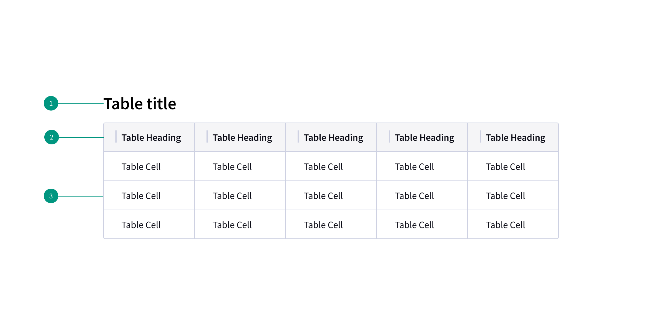
- Title and description: contains the data table title and an optional description.
- Column header: title for the row header with the optional sorting behavior.
- Table row: can be configured to show different types of data. Rows can be selectable, expandable, and modified to show alternating zebra stripe background colors.
When to use
- To organize and display data
- If your user must navigate to a specific piece of data to complete a task
- When listing locations or resources that have similarly structured content for many items
When not to use
- When a more complex display of the data or interactions are required
- As a replacement for a spreadsheet application
- For groups of items with different structures — consider a list or cards instead
Best practices
Keep it simple
Minimal visual styling ensures the table's content remains easy to read.
Minimize the number of columns
It's easier for users to read down a list of rows than across a long list of columns. Where possible, use fewer columns.
Use table headers
Use table headers to tell users what the rows and columns represent.
Related components
Content
Main elements
Data table title and description
- The table title should make it clear to the user what this the data has in common and what purpose it serves in the UI.
- A description can be added under the title to provide more information about the data or its source.
- A data table’s title and description should use sentence-case capitalization.
Column titles
- Column titles should stick to one or two words that describe the data in that column.
- In cases where a column title is too long, wrap the text to two lines and then truncate the rest of the text. The full text should be shown in a tooltip on hover.
- Column titles should use sentence-case capitalization.
References
Data Tables: Four Major User Tasks, Nielsen Norman Group
U.S. Web Design System (USWDS)