
Dropdown
Dropdowns allow users to select from a list of options. A selected option can represent a value in a form, or it can be used as an action to filter or sort existing content. Multiselects and combo boxes also fall under the category of dropdowns.
Dropdown: allows users to select one option from a list
Multiselect: allows users to select multiple options from a list and filter
Combo box: allows users to make a selection from a list of suggested, likely, or desired values
Overview
Anatomy
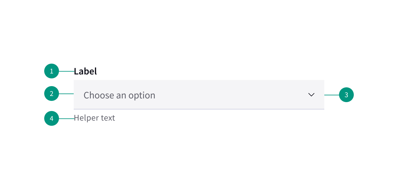
- Group label
- Selection box
- Chevron (expand/collapse)
- Helper text
When to use
- In forms, in modals, or on side panels
- To filter or sort contents on a page
When not to use
- When typing may be faster
- If there are only two options to choose from
- For overly complex information
Best practices
Avoid multiple lines of text
If the text can’t fit on one line, truncate it using ellipses and reveal the rest of the text on hover.
Avoid decorative images or icons
Use utility icons within a dropdown where appropriate.
Variants

Dropdown
Use when you can select only one option from a list at a time. The dropdown displays placeholder text in the field when closed.
Clicking on a closed field opens a menu of options.
Selecting an option from the menu closes it, and the selected option text replaces the placeholder in the field. It also remains as an option in place if the menu is open.

Multiselect
Use when you can select multiple options from a list or to filter information.
Placeholder text appears in the field by default.
Clicking a closed field opens a menu of options. Each option contains a checkbox to the left of the option text.
The menu stays open while options are being selected. The menu closes by clicking the field or clicking outside of the menu.
Users can start typing in the input field to filter options.
Combo box
Use when there are a large amount of options to choose from and users need to make a selection from a predefined list of options.
The menu opens by clicking anywhere in the field. Users can start typing to sort through a list of options. The option that best matches the typed characters is highlighted.
Selecting an option closes the menu, and the selected option replaces the placeholder text.
Related components
Content
Use informative labels
Labels should tell users what they can expect.
Limit labels to a single line of text
Avoid using multiple lines of text for labels
Include helper text
Use helper text to assist the user in choosing the right selection. This is always available when the dropdown field is focused and appears underneath the label. Use sentence case and full punctuation for helper text.
Use clear placeholder text
When used, placeholder text should help users understand the purpose of a field. Placeholder text is appears in the field by default if no selection has been made.
Limit menu options to one line of text
Present options in alphabetical order unless there is a clear usability case to do otherwise.
Behaviors
States
Dropdown states include enabled, hover, focus, error, warning, disabled, and read-only.
Interactions
Mouse
Users can open a dropdown menu by clicking the chevron icon or anywhere within the field. Users can close the dropdown by clicking the chevron icon or clicking outside of the menu.
To select an option, users can click anywhere inside an option container.