Dropdowns allow users to select from a list of options. A selected option can represent a value in a form, or it can be used as an action to filter or sort existing content. Multiselects and combo boxes also fall under the category of dropdowns.
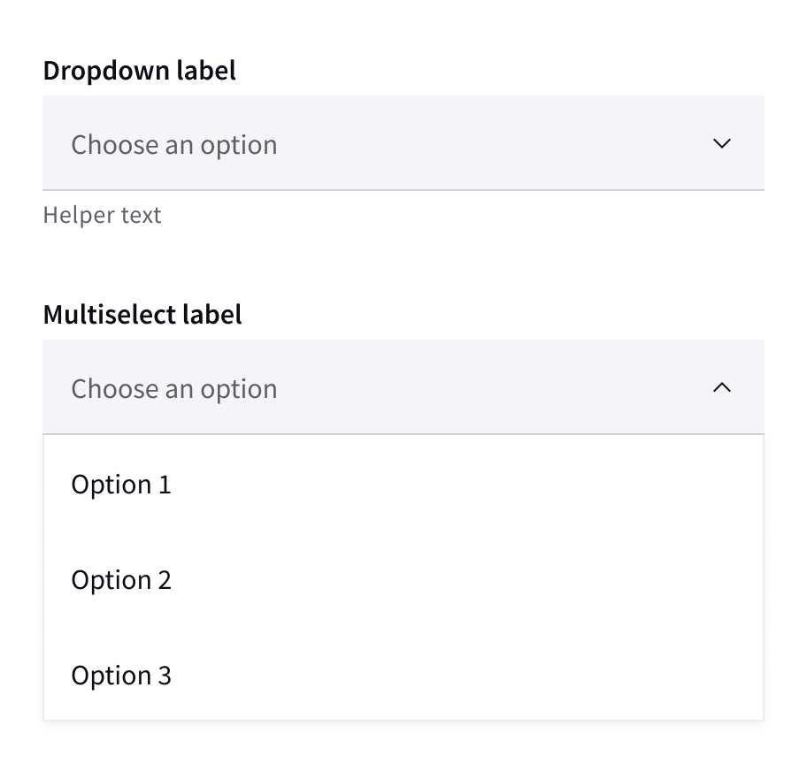
Dropdown: allows users to select one option from a list
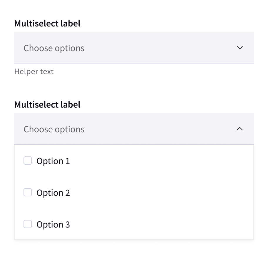
Multiselect: allows users to select multiple options from a list and filter
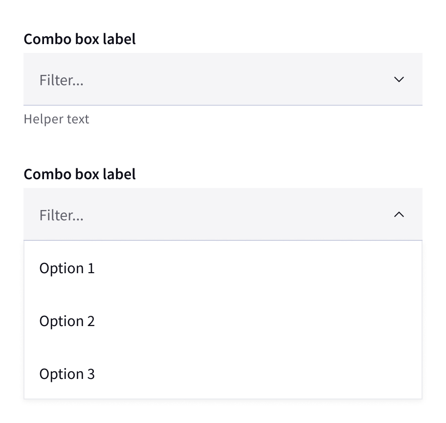
Combo box: allows users to make a selection from a list of suggested, likely, or desired values
Color
Color
| Element | Property | Color token |
|---|
| Label | text-color | $text-primary |
| Field text | text-color | $text-primary |
| Field text:prompt | text-color | $text-secondary |
| Helper text | text-color | $text-secondary |
| Field | background-color | $field-01 |
| | border-bottom | $border-subtle-01 |
| Chevron icon | svg | $icon-primary |
| Menu option | text-color | $text-primary |
| | background-color | $layer-02 |
| | border-top | $border-subtle-02 |
| Menu | box-shadow | |
| Checkbox | border-color | $border-subtle-01 |
Typography
| Element | Font-size (px/rem) | Font-weight | Type token |
|---|
| Label | 16 / 1 | Semibod / 600 | $heading-compact-01 |
| Field text | 16 / 1 | Regular / 400 | $body-compact-01 |
| Menu option text | 16 / 1 | Regular / 400 | $body-compact-01 |
| Helper text | 14 / 0.875 | Regular / 400 | $helper-text-01 |
| Error message | 14 / 0.875 | Regular / 400 | $helper-text-01 |
Structure
Margins and padding
| Element | Property | px/rem | Spacing token |
|---|
| Label | margin-bottom | 4 / .25 | $spacing-02 |
| Field | padding-left | 16 / 1 | $spacing-05 |
| | padding-right | – / – | $spacing- |
| | border-bottom | 1px | – |
| Chevron icon | padding-right, padding-left | 16 / 1 | $spacing-05 |
| Helper text | margin-top | 4 /.25 | $spacing-02 |
Sizes
| Element | Size | Height (px / rem) | Spacing token |
|---|
| Field | Extra small (xs) | 32 / 2 | $spacing-07 |
| | Small (sm) | 40 / 2.5 | $spacing-08 |
| | Medium (md) | 48 / 3 | $spacing-09 |
| Menu item | Extra small (xs) | 32 / 2 | $spacing-07 |
| | Small (sm) | 40 / 2.5 | $spacing-08 |
| | Medium (md) | 48 / 3 | $spacing-09 |