
Date picker
A date picker is a component used in web forms and applications that allow users to select dates through a calendar-style interface. The primary purpose is to provide an intuitive way for users to input or choose specific dates.
Overview
Anatomy
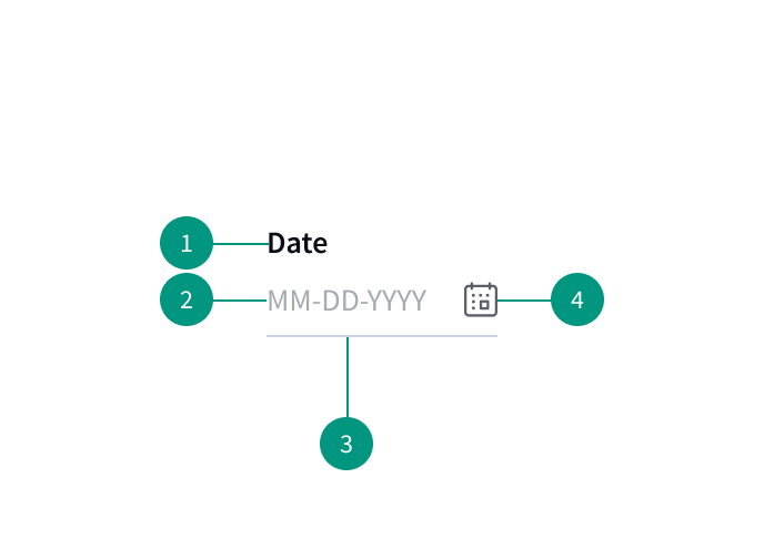
- Field label: The field label should be visible at all times
- Placeholder text: Optional placeholder text may help inform users how to input content
- Container area: Clickable area for data entry
- Icon: Indicates calendar menu is available
When to use
- When asking the user for a date or time
- For scheduling appointments, tasks, reservations, etc.
When not to use
- If there’s a limited date range, a date picker should not be necessary. Instead, add a simple input field with a validation button.
Best practices
Use placeholders to indicate input formatting
Provide placeholders for date formatting so that users know how to input their information with the correct formatting.
Make formatting suggestions visible during input
Continuously provide the suggested date formatting as users are entering information so they don’t forget what format they should be using.
References
Date Picker, Material Design
Date Picker Design Best Practices, Medium
Date Picker, IBM Carbon Design System
U.S. Web Design System (USWDS)