
Text input
Text inputs enable users to enter free-form text data for both for long and short-form entries.
Overview
Anatomy
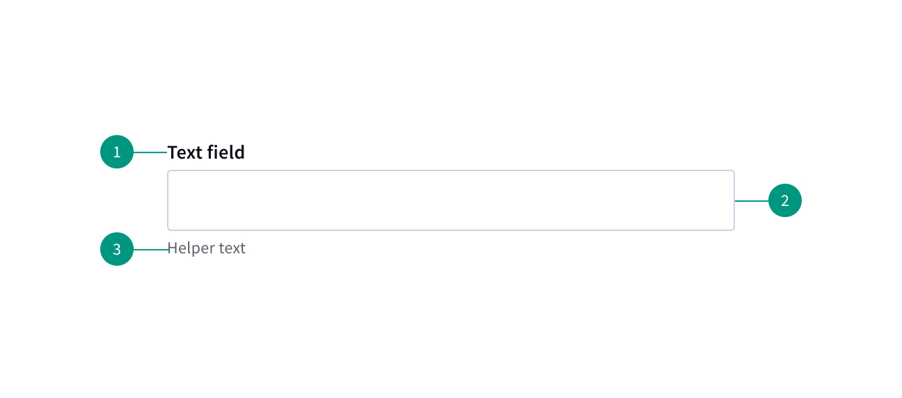
- Field label: Text that informs the user about the content they need to enter in the field.
- Field: The container in which a user enters data. Must meet 3:1 non-text contrast requirements.
- Helper text: Optional assistive text that can provide additional aid or context to the user. Often used to explain the correct data format.
When to use
- For inputting information that can’t be predicted with preset options
- A user needs to input information that can be entered more quickly without a more complex control (e.g. their birthday)
When not to use
- If options must be limited to a predefined list
Best practices
- Keep labels visible. Labels for text inputs should remain visible at all times.
Variants
Text input: When the expected user input is a single line of text.
Text area: When the expected user input is more than a few words that could span multiple lines.
Related components
Formatting
Alignment
Input labels should vertically align to the grid and with other type elements on the page. Inputs are always flush to the columns.
Content
Main elements
Labels
Effective labeling helps users understand what information to enter into a text input. Text fields should always have a label.
- Use sentence-style capitalization for all labels, except for proper nouns.
- Keep the label short and concise.
- Do not use colons after label names.
Helper text
Optional helper text is pertinent information that assists the user in correctly completing a field. It is often used to explain the correct data format.
- Use sentence-style capitalization and write the text as full sentences with punctuation.
- Helper text appears persistently underneath the field, except when an error or warning message replaces it.
Placeholder text
Optional placeholder text provides hints or examples of what to enter. Placeholder text disappears after the user begins entering data into the input. As such, it should not be used as a replacement for a persistent label nor should it contain crucial information.
- Use sentence-style capitalization, and in most cases, write the text as a direct statement without punctuation.
- Placeholder text is not required and by default not shown in text input fields.
- Placeholder text can be harmful to user interactions and should only be added when necessary.
Overflow content
Overflow in a text area
If a user’s content exceeds the vertical space of the variable text area then a user can either expand the field container using the resize handle or they can vertically scroll the content inside the set field container.
References
Website Forms Usability: Top 10 Recommendations, Nielsen Norman Group
Placeholders in Form Fields Are Harmful, Nielsen Norman Group
U.S. Web Design System (USWDS)