
Radio button
Radio buttons are used when there is a list of two or more options that are mutually exclusive. When a user chooses a new item, the previous choice is automatically deselected.
Overview
Anatomy
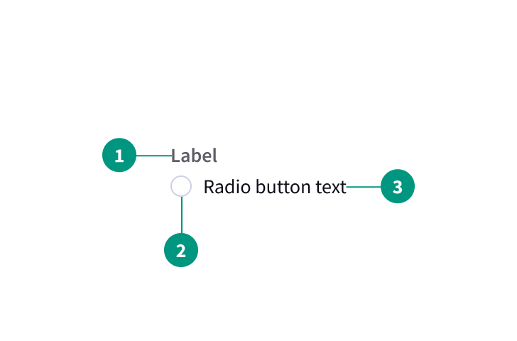
- Label
- Radio button
- Radio button text
When to use
- When choices are mutually exclusive
- To change from one setting to another
When not to use
- When there are multiple choices (use checkboxes instead)
- For filtering and batch actions
- When changes should take effect immediately (use a toggle switch instead)
Best practices
Always offer a default selection for radio button lists
This should be the most desired or frequently selected option.
Include an option to make no selection, such as "none."
Users should be able to access a null selection if none of the provided options are applicable.
Make both the button and its label clickable.
Let users select an option by clicking on either the button itself or on its label.
Don’t use radio buttons as action buttons that make something happen
Any changes should only take effect once the user clicks a separate action button to save or proceed.
Clicking a cancel or back button should discard any changes the user has made to their selections
If a user clicks back and then forward, interpret this as an Undo/Redo pair, meaning that the user’s selections should be restored as if the user had never clicked back. Changes should still not take effect until the user chooses to save or proceed.
Related components
Checkbox, toggle, or radio button: how to choose
|
Radio buttons |
Checkboxes |
Single checkbox |
|
Multiple |
Multiple |
1 |
|
1 |
0–all |
2 (on/off) |
|
Yes |
No |
Yes |
|
Yes |
No |
Yes |
|
After a user clicks a submit button |
After a user clicks a submit button |
After a user clicks a submit button |
Formatting
Alignment
Labels
Radio button labels are positioned to the right of their inputs.
Groupings
Radio button groupings can be laid out vertically or horizontally depending on the use case. When possible, arrange radio button groups vertically for easier reading.
Content
Make sure options are comprehensive and clearly distinct. Consider offering a button labeled “Other” supplemented by a text field if there may be additional options not included in the list.
A heading can precede a set of radio buttons to provide further context or clarity. Use sentence case for group labels.
Do not truncate radio button label text with ellipses. If it isn’t possible to rewrite the label to fit on a single line, labels may wrap to a second line. Text should wrap beneath the radio button so the control and the label are top aligned.
Behaviors
States
Radio button input allows for two states: selected and unselected. Only one radio button should be selected at a time. When a user chooses a new item, the previous choice is automatically deselected. Radio buttons also have states for focus, disabled, read-only, error, and warning.
Interactions
Mouse
Users can trigger an item by clicking the radio button directly or by clicking the button’s label. This creates a more accessible click target.
Keyboard
One radio button should be selected by default. Users can navigate between radio button options by pressing the up or down arrow keys.
References
Radio Buttons: Select One by Default or Leave All Unselected?, Nielsen Norman Group
Checkboxes vs. Radio Buttons, Nielsen Norman Group
U.S. Web Design System (USWDS)