
Tabs
Tabs allow users to navigate between related sections of content without leaving a page. Tabs contain at least two items, and one tab is active at a time.
Overview
Anatomy
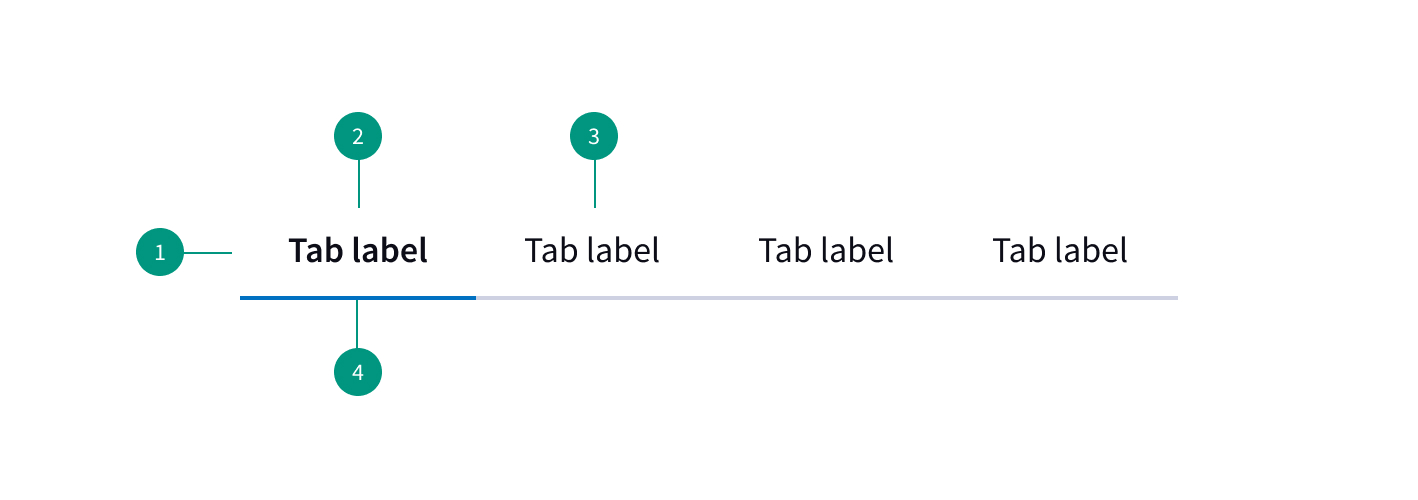
- Container
- Active tab
- Inactive tab
- Status indicator
When to use
- To group related information into different categories
- To organize content such as forms, settings, and dashboards so a user doesn’t have to navigate away from their workflow to complete a task
- When users do not need to view all the sections at once
When not to use
- For primary navigation
- To indicate progress
- If the user needs to compare information in two groups
Best practices
Put the most commonly-needed section first
The first tab should be the most commonly-needed section for users. Arrange the other tabs in an order that makes the most sense for your users.
Logically organize the content behind the tabs
This helps users easily predict what they’ll find when they select a given tab.
Tabs should be parallel in nature
Keeping tabs parallel in nature ensures that users don’t interpret them as site navigation.
Prominently highlight the currently selected tab
Unselected tabs should remain clearly visible and readable so the user can see the additional options.
Use sentence case
Do not use all caps for labels.
Don't use multiple rows
Stick to only one row of tabs.
Related components
Formatting
Alignment
Alignment will vary depending on context, but in general the first tab should align with the left margin of the page.
Tabs are auto-width by default and will resize to fit the label text.
Placement
Tabs should be placed on top of the tab panel, not on the sides or bottom.
Content
Labels
Labels should be short, clear, and specific — limit to one or two words.
Labels should clearly communicate what the users will see if they click on the tab.
Behaviors
States
Tabs have three states: selected, unselected, and disabled.
The first tab is usually preselected. When a user chooses a new item, the previous tab is automatically deselected.
Overflow
Left and right navigational arrows can be used to scroll through tabs if your page requires more tabs than can fit in the browser window.
Interactions
Mouse
Users can trigger a state change by clicking anywhere in the container area.
Keyboard
One tab should be selected by default. Users can navigate between tabs by pressing right or left arrow keys.
References
Tabs, Used Right, Nielsen Norman Group
U.S. Web Design System (USWDS)