
Card
Cards provide designers a place to organize text and/or images into sections that can be easily scanned.
Overview
Anatomy
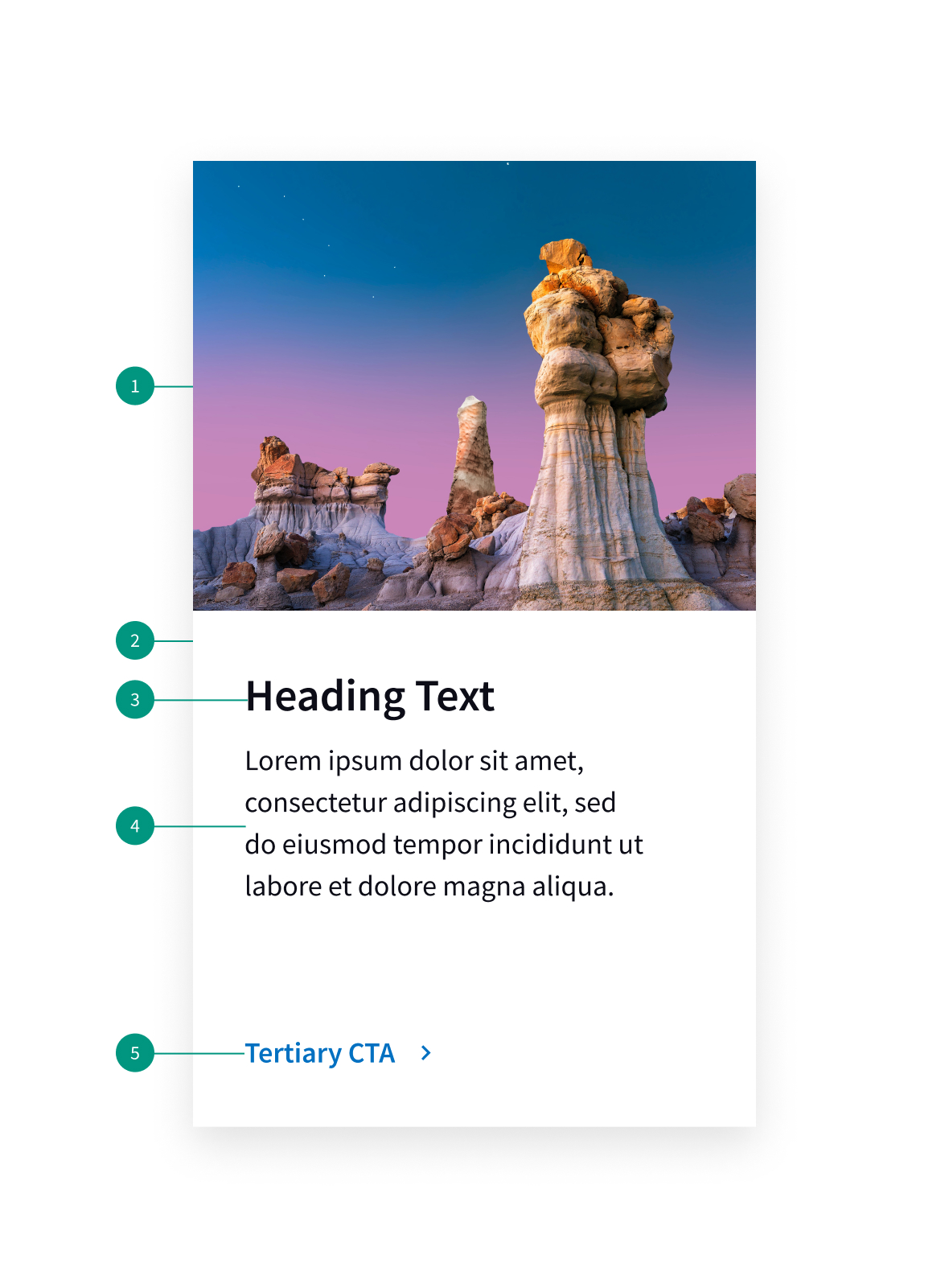
- Image
- Card background
- Heading
- Description
- Button
When to use
- To organize large amounts of content
- When something needs to be summarized and can be used to think to additional materials
- To provide a preview of featured or upcoming events on a category or higher tiered page
- When providing a complete list of events on a dedicated events page.
When not to use
- When page load times are crucial.
- When screen space is limited
- When card expansion will disrupt the page flow
Best practices
Make cards actionable.
Since cards are used as a summary of more detailed information, any individual card should link out to that information.
Use a grid
Grids should be used to keep cards and content organized.
Use relevant images
These can help users scan through the cards faster. Don’t repeat images or content common to all or most cards in a collection, as this makes it more difficult to distinguish cards from one another.
Keep text brief
Prioritize information to make the most effective use of limited space.
Related components
Content
Descriptions
Keep descriptions short and trim to 2 or 3 lines if the content exceeds available space or character limit.
Call to action
If a call to action is included, make sure it clearly informs the user what they can expect when clicking the link.
References
UI-Component Definition, Nielsen Norman Group
U.S. Web Design System (USWDS)
Design Better Cards, Medium
Card-based Design: the Pros & Cons of Best Practices, Medium