
Banner
Banners show a variety of visual and textual content in a horizontal layout.
Overview
Anatomy
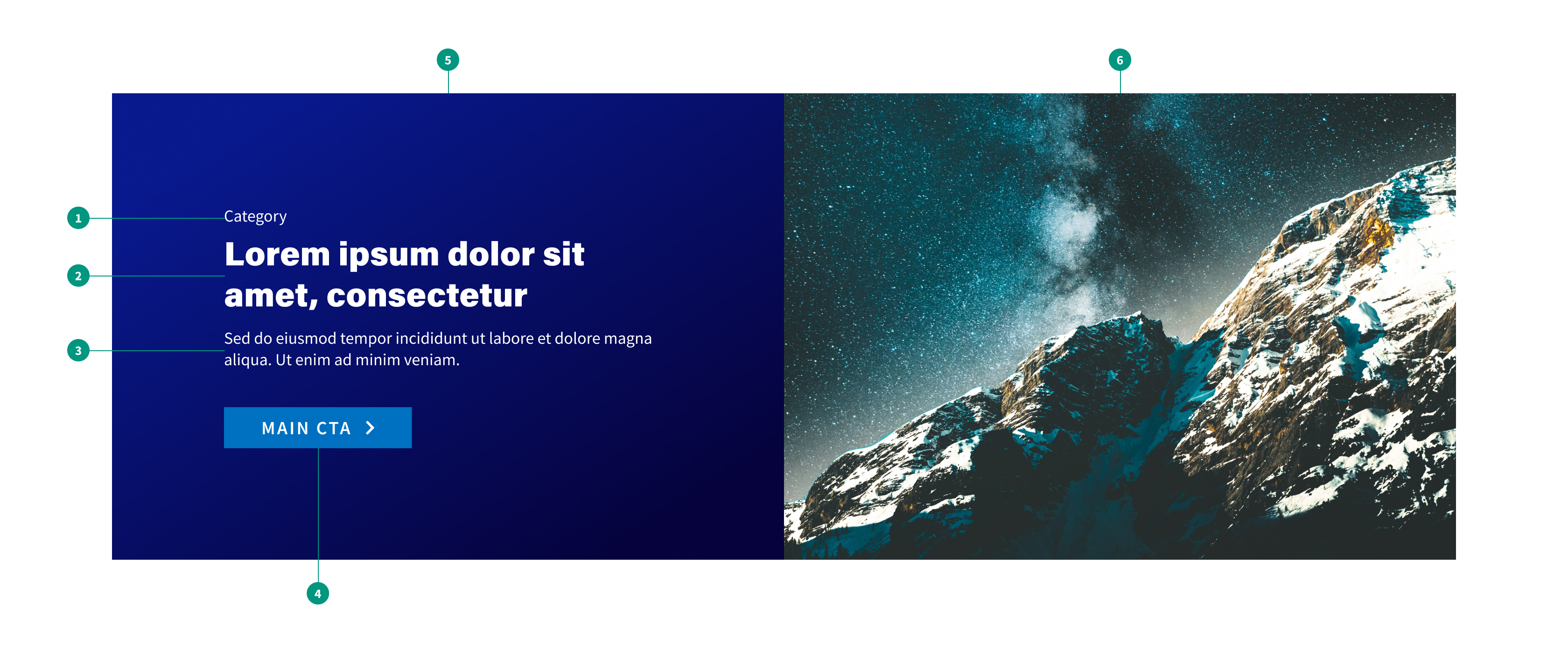
Feature banner

- Tag: A short optional description for categorization
- Heading: Brief heading text featuring most important content
- Description: Additional descriptive text to provide more information
- Button: Short call to action
- Background image: Illustrative image
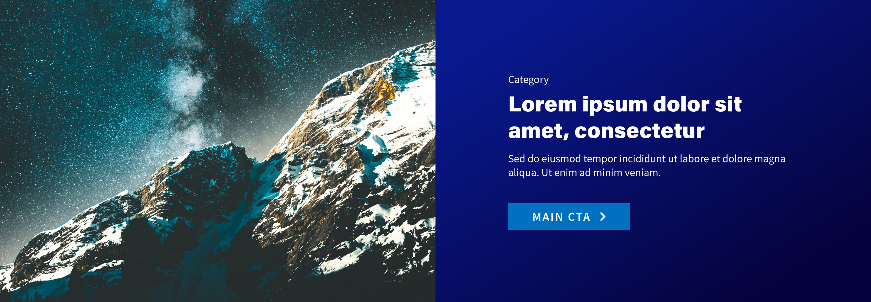
Split banner
- Tag: A short optional description for categorization
- Heading: Brief heading text featuring most important content
- Description: Additional descriptive text to provide more information
- Button: Short call to action
- Text background: Background gradient
- Image: Illustrative image
When to use
- To draw attention to specific featured content
- To break up large bodies of text to help lighten cognitive load
When not to use
- For content of less importance to users
- For a series of related content with different headings — use an accordion instead
- For utility messages — use an alert instead
Best practices
Limit to high-value content
Banners interrupt users in the flow of reading content. Banners should only be used to feature content that is of high value to users and that cannot be effectively displayed with another component.
Avoid stacking
Avoid stacking banners whenever possible, as this can contribute to cognitive overwhelm for users.
Variants
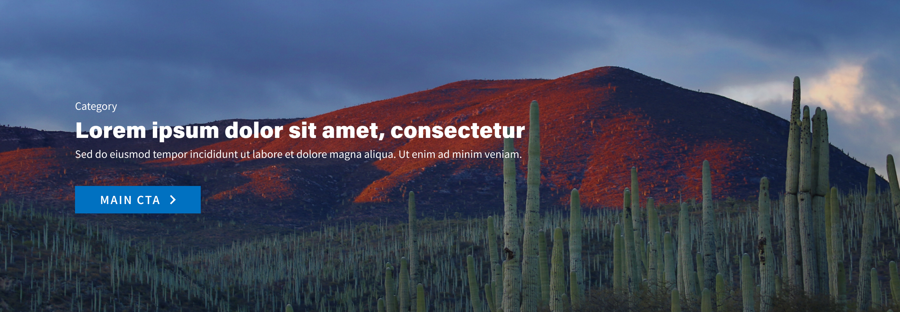
Feature banner
Use with an eye-catching image for high value content.
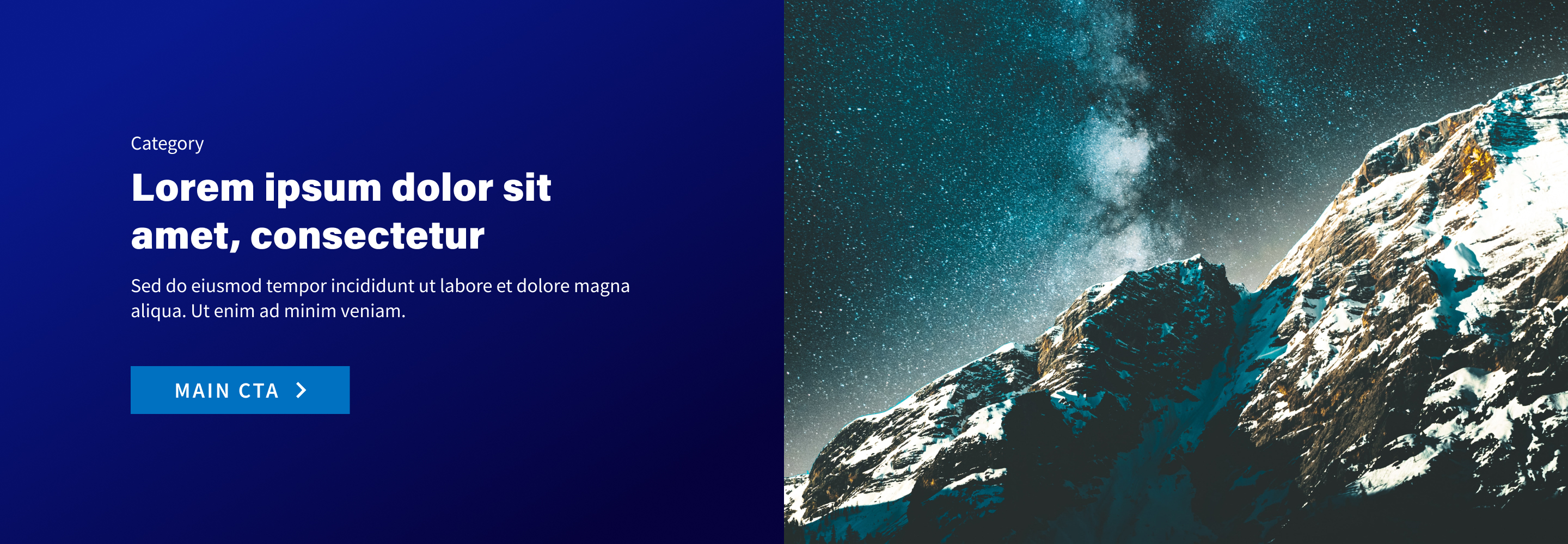
Split banner: media left
Use for secondary banners.
Split banner: media right
Use for secondary banners.
Related components
Formatting
Alignment
Text
Text should be left-aligned. Do not use right-aligned, centered, or justified text in banners.
Button
The call to action button should be aligned to the far left edge of the text.
Content
Descriptive text
Descriptive text should be clear and concise. Users should be able to quickly scan the text to learn more about the featured content.
Call to action
If a banner links the user to specific content, include a clear call to action that informs the user what they can expect when clicking the link.
References
The Layer-Cake Pattern of Scanning Content on the Web, Nielsen Norman Group