
Toggle
A toggle is a digital on/off switch. These are best used for changing the state of system functionalities and preferences. They may replace two radio buttons or a single checkbox to allow users to choose between two opposing states.
Overview
Anatomy
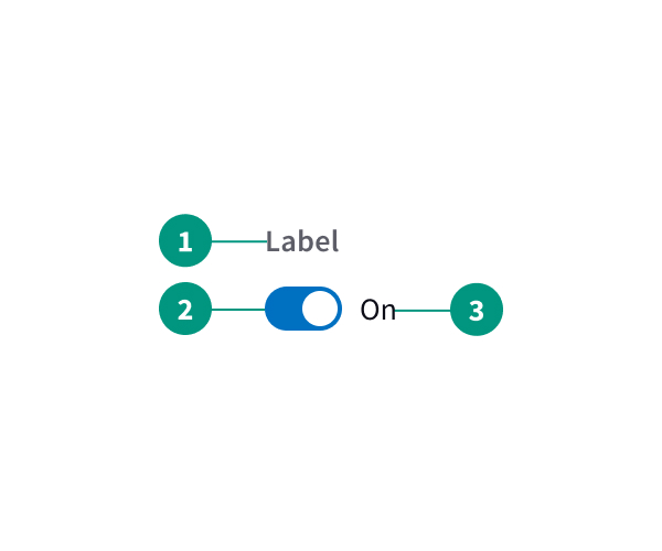
- Label: Clear label to denote what is affected by the toggle switch
- Toggle: Toggle clearly denotes current status
- Status: Clear status indicator
When to use
- When choices are mutually exclusive
- When the change should take effect immediately
When not to use
- When there are multiple choices
- When the change should take effect after the user clicks a submit button (use radio buttons instead)
Related components
Checkbox, toggle, or radio button: how to choose
|
Radio buttons |
Checkboxes |
Single checkbox |
|
Multiple |
Multiple |
1 |
|
1 |
0–all |
2 (on/off) |
|
Yes |
No |
Yes |
|
Yes |
No |
Yes |
|
After a user clicks a submit button |
After a user clicks a submit button |
After a user clicks a submit button |
Content
Labels for toggle switches should be short and direct. Avoid writing questions and aim for scannability.
Toggle labels should describe what the control will do when the switch is on. They should not be neutral or ambiguous. If you can’t append “on/off” to the end of your label and have it make logical sense, rewrite it.
Including state descriptors next to the toggle can improve clarity.
References
Toggle-Switch Guidelines, Nielsen Norman Group
U.S. Web Design System (USWDS)